


Bannière d’informations en CSS
Publié le 06/12/2022 par Build Your Web
Bannière d’informations en CSS
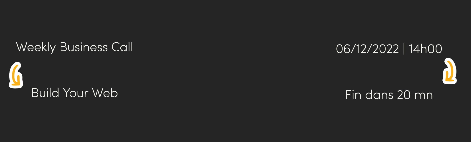
Dans ce tutoriel, nous allons voir comment réaliser l’animation ci-dessous (une bannière d’informations en CSS seulement).
Cette animation m’a été inspirée par les pieuvres de Microsoft dans les salles de réunions. J’ai trouvé que cela permettait de fournir plusieurs informations de manière récurrente sans surcharger l’écran de la pieuvre. Pour ceux qui ne voient pas de quoi nous parlons, voici un exemple de pieuvre. Le défi a été de réaliser cette animation simplement en HTML et CSS (tout en optimisant le nombre de lignes). Passons donc à la réalisation de cette animation !
Du côté HTML
A vrai dire, cette partie est vraiment simple. Il suffit de créer un div qui va contenir nos différents titre. Attention: le nombre de titre fera varier le code CSS. Pour cette exemple nous sommes partis sur 4 informations liées à une réunion:
- Weekly Business Call (Titre de la réunion)
- Build Your Web (Organisateur)
- 06/12/2022 | 14h00 (Date et Heure)
- Fin dans 20 mn (Temps restant)
Ce qui nous donnes donc le code HTML suivant. A intégrer dans une page complète ou simplement en prenant à partir de la partie .text
<body>
	<div class="center-form">
		<div class="text">
			<h2>Weekly Business Call</h2>
			<h2>Build Your Web</h2>
			<h2>06/12/2022 | 14h00</h2>
			<h2>Fin dans 20 mn</h2>
		</div>
	</div>
</body>
Côté CSS maintenant
Pour réaliser cette animation, nous allons utilisé trois éléments importants en CSS :
- L’attributs « animation »
- Le sélecteur « nth-child »
- L’élément @keyframes
Pour commencer, nous avons positionné tous les éléments H2 de manière à ce qu’ils soient tous au même endroit et invisible (en combinant les attributs transform et position et opacity.
.text h2 {
    color: #fff;
    position: absolute;
    text-align: center;
    font-size: 20px;
    font-weight: 100;
    height: 50px;
    transform: rotateX(-90deg) translateZ(20px);
    transition: .5s;
    opacity: 0;
    transform-style: preserve-3d;
}
Il nous faut ensuite créer la fameuse animation. De ce côté, nous allons utiliser 1 animation qui sera commune à tous les H2. L’animation doit donc démarrer en état invisible, tourner et se positionner de face puis accélérer pour être masquée et revenir à sa position initiale. Voici ce que cela donne comme code.
@keyframes animatedtTxt {
    0% {
        transform: rotateX(-90deg) translateZ(20px);
        opacity: 0;
    }
    25% {
        transform: rotateX(0deg) translateZ(0px);
        opacity: 1;
    }
    35% {
        transform: rotateX(-90deg) translateZ(-20px);
        opacity: 0;
    }
    100% {
        transform: rotateX(-90deg) translateZ(20px);
    }
}
Maintenant que l’animation est créée, il suffit de l’appeler pour chaque élément H2. Pour cela nous utilisons le sélecteur nth:child() et l’attribut animation-delay pour décaler le démarrage de l’animation pour chaque H2. L’animation totale dure 8s, et chaque élément est affiché 2s. Alors on décale le démarrage de 2s chaque élément (fonctionne avec le timing de l’animation animatedText). Alors oui, l’animation-delay peut-être intégrée directement dans l’attributs animation (économie de 4 lignes de code) mais pour l’explication c’est plus « visuel ». Cadeau, vous avez les deux :
Avec le détail:
h2:nth-child(1){
    animation: animatedtTxt 8s infinite;
    animation-delay: 0s;
}
h2:nth-child(2){
    animation: animatedtTxt 8s infinite;
    animation-delay: 2s;
}
h2:nth-child(3){
    animation: animatedtTxt 8s infinite;
    animation-delay: 4s;
}
h2:nth-child(4){
    animation: animatedtTxt 8s infinite;
    animation-delay: 6s;
}
Avec Optimisation:
h2:nth-child(1){
    animation: animatedtTxt 8s infinite 0s;
}
h2:nth-child(2){
    animation: animatedtTxt 8s infinite 2s;
}
h2:nth-child(3){
    animation: animatedtTxt 8s infinite 4s;
}
h2:nth-child(4){
    animation: animatedtTxt 8s infinite 6s;
}
Voila comment réaliser cette animation en utilisant simplement du CSS. Après, il ne vous reste plus qu’à coupler ce code avec un peu de javascript pour dynamiser les valeurs (comme le temps restant). Voici le code complet pour réaliser cette Bannière d’informations en CSS !
HTML (19 Lignes)
<!DOCTYPE html>
<html>
<head>
	<meta charset="utf-8">
	<meta name="viewport" content="width=device-width, initial-scale=1">
	<link rel="stylesheet" type="text/css" href="style.css">
	<title>Variable Text</title>
</head>
<body>
	<div class="center-form">
		<div class="text">
			<h2>Weekly Business Call</h2>
			<h2>Build Your Web</h2>
			<h2>06/12/2022 | 14h00</h2>
			<h2>Fin dans 20 mn</h2>
		</div>
	</div>
</body>
</html>
CSS (63 Lignes)
@import url('https://fonts.googleapis.com/css2?family=Nunito:wght@200&display=swap');
body {
    width: 100%;
    margin: 0;
    padding: 0;
    font-family: 'Nunito', sans-serif;
    overflow: hidden;
    background-color: #141211;
}
.center-form {
   width: 300px;
   height: 50px;
   overflow: hidden;
   position: absolute;
   top: 50%;
   left: 50%;
    transform: translate(-50%,-50%);
}
.text {
    position: relative;
    height: 50px;
    display: flex;
    justify-content: center;
}
.text h2 {
    color: #fff;
    position: absolute;
    font-size: 20px;
    font-weight: 100;
    height: 50px;
    transform: rotateX(-90deg) translateZ(20px);
    transition: .5s;
    opacity: 0;
}
h2:nth-child(1){
    animation: animatedtTxt 8s infinite 0s;
}
h2:nth-child(2){
    animation: animatedtTxt 8s infinite 2s;
}
h2:nth-child(3){
    animation: animatedtTxt 8s infinite 4s;
}
h2:nth-child(4){
    animation: animatedtTxt 8s infinite 6s;
}
@keyframes animatedtTxt {
    0% {
        transform: rotateX(-90deg) translateZ(20px);
        opacity: 0;
    }
    25% {
        transform: rotateX(0deg) translateZ(0px);
        opacity: 1;
    }
    35% {
        transform: rotateX(-90deg) translateZ(-20px);
        opacity: 0;
    }
    100% {
        transform: rotateX(-90deg) translateZ(20px);
    }
}
Vous pouvez retrouver tous nos autres articles sur le CSS en allant sur notre catégorie CSS. Vous pouvez également découvrir notre Plugin ShortUrl Tracker qui vous permet de gérer vos URLs Courtes depuis votre site.